Mindler
Mental Healthcare App
Background
Mindler was founded in 2018 with the vision that everyone should have the chance to see a psychologist. By using their mobile app, users can find and get in contact with a psychologist that matches their needs. Often on the same day. As I onboarded I was asked to develop a concept app for helping people with social anxiety overcome and handle their worst fears about social situations.
Research
During my initial interviews with psychologists I learned about the importance for patients to create their own hierarchy of personal issues to work with. These could come from lists of common issues, as well being defined by the patient. With such a list in place they would be able to start practicing graduated exposure towards a set goal by:
- Shifting focus outwards instead of inwards.
- Doing exercises in a safe environment i.e. “dry-runs” before going out in real world.
- Monitor progress and “keeping it up”
As I mapped out what others were doing in the field it became clear that many apps and services offered diary keeping, exercises and guidance, but there seemed to be a general lack of clear reasons for the user to come back, and keep at it.
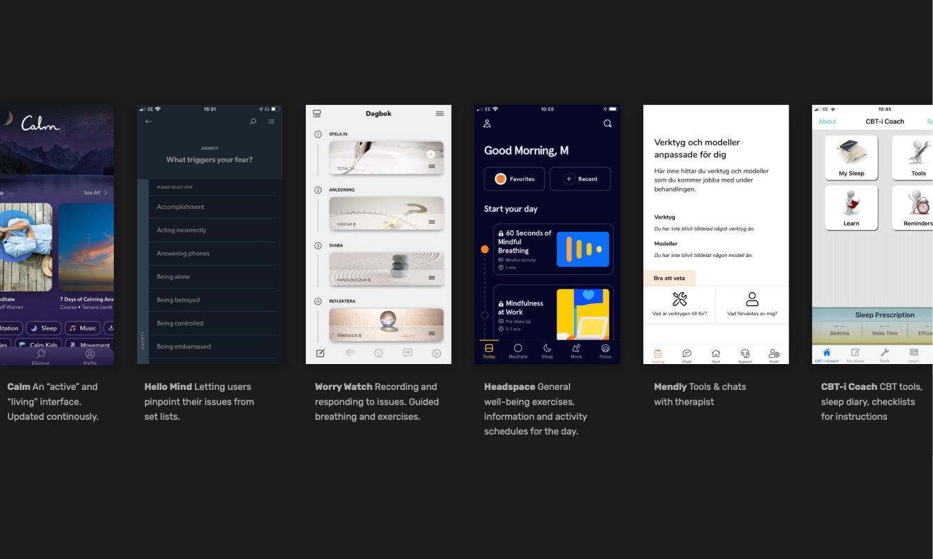 Mapping out and comparing what others in the field were doing.
Why not Social Media?
While creating a social platform – letting people with similar challenges help each other – could have been a way forward, there are such massive challenges in avoiding bullying or erroneous treatment in a digital social environment. So the focus was instead to provide tools and guidance, to help in everyday life. Letting users reach out instead of “staying digital”.
The most important parts
In order to successfully cater to the needs of the user, the following points were mapped out as most important, providing a foundation for creating a menu structure:
- Onboarding A rather rigorous onboarding to pinpoint the needs for the user and the structure for progressing – creating a hierarchy of challenges and setting a schedule for check-ins.
- Excercises At the core of the app. A todo-list of sorts with all the issues to be faced.
- Tips Connected to where each user would be in his/her progress, a tips section would always be available, since building recilience against social anxiety is largely based on learning.
- Tools A library of tools that builds up as the user progresses.
- Contact with Therapist There should always be an option available to check-in with a therapist who can review the progress, stay up-to-date and offer advice.
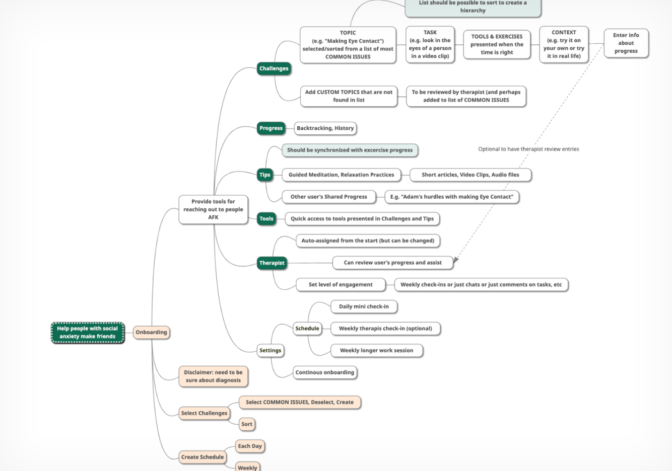 Simplified overview of the menu structure.
Retention
In order to improve mental health in a long-term perspective there is a need for the user to keep the momentum up and keep practicing. The app would have to address this by providing goals, guidance, personalization, stories from other people in similar situations and a continously updated content to give incentives to come back.
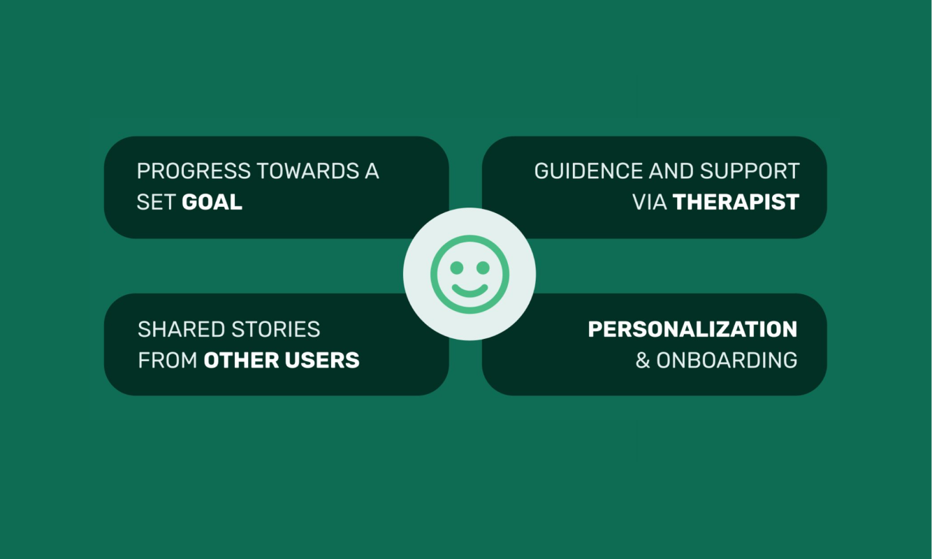 The four main areas to keep the user coming back.
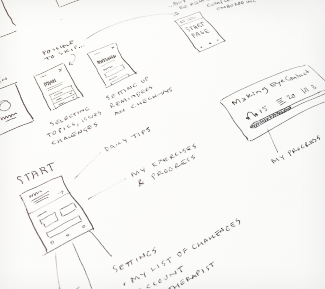
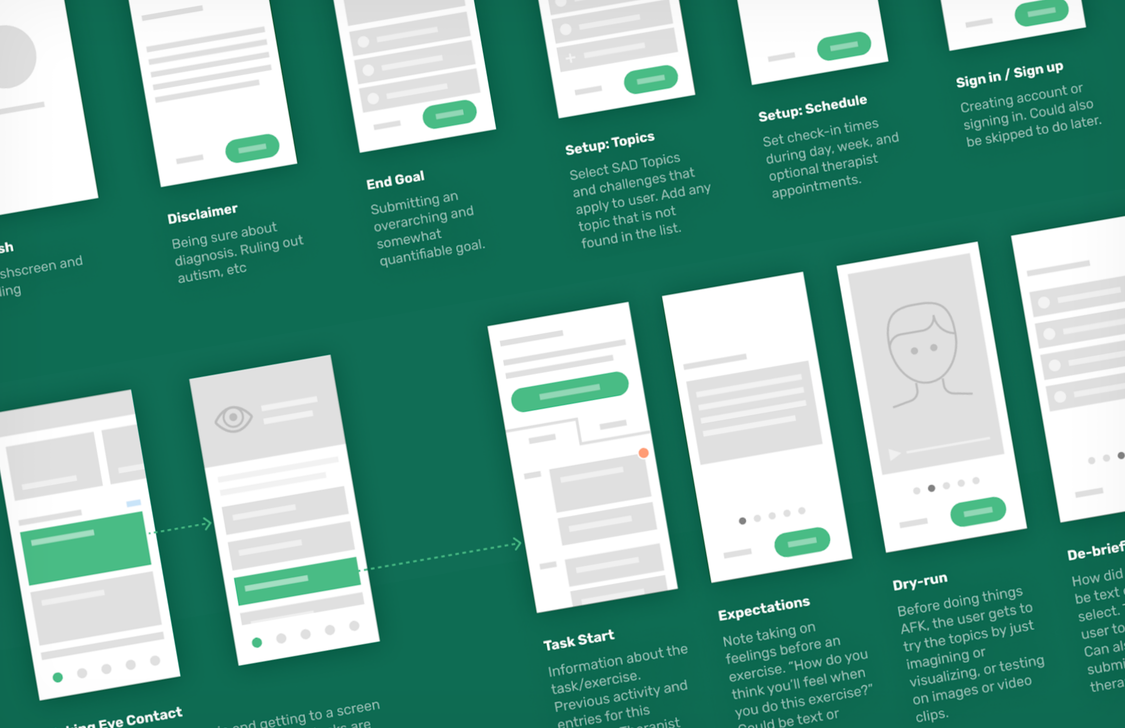 Minimalistic wireframes to get an ultra-quick overview of the screen flow.
The visual aspect
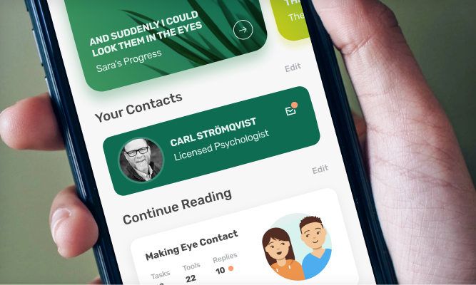
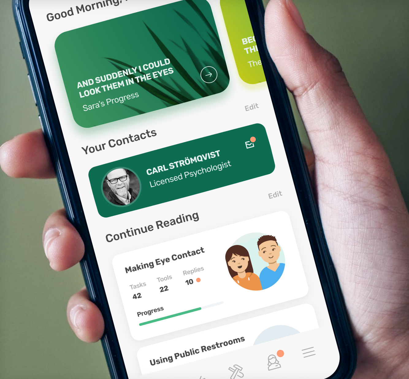
The app was designed to not feel too medical or stigmatising, but still serious and trustworthy. Showing the Therapist on the start page was partly to be able to quickly get in contact, but also to ensure the user that there are real people behind the app, not just automations and bots.
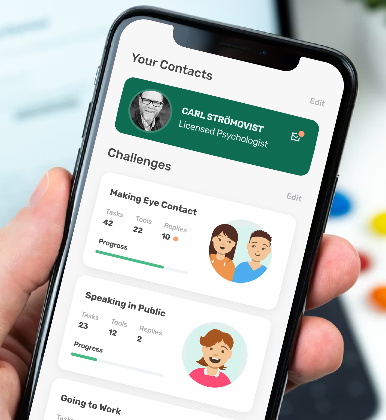 Keeping the user curious about the progress, providing challenges.
To prevent users from feeling overwhelmed, and to help them focus on what’s relevant in the stage they’re in, tasks and challenges were only activated as the ones before were finished.
After finishing a Challenge, booster sessions would appear after a period of time, to help the user repeat and re-cap. These were indicated on the cards, to create a “living” start page.
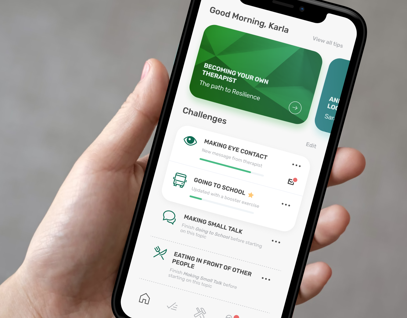 A more compact start screen layout with active as well as not-yet-active challenges.


